

British interior design has witnessed a dramatic shift in recent years, with warm whites emerging as the undisputed champion of contemporary colour schemes. Designers across the UK are abandoning the once-ubiquitous cool greys that dominated living spaces for over a decade, embracing instead the softer, more inviting tones of cream, ivory, and off-white. This transformation reflects a broader cultural movement towards creating homes that prioritise comfort and warmth over the clinical minimalism that previously held sway. The change represents more than a simple aesthetic preference; it signals a fundamental rethinking of how colour influences our daily lives and emotional wellbeing within domestic spaces.
Why warm whites dominate colour palettes
The evolution from cool to warm tones
The dominance of warm whites in contemporary design stems from a natural reaction against the stark coldness that characterised interiors throughout the 2010s. Cool greys, whilst initially fresh and modern, eventually created spaces that felt impersonal and uninviting. Designers and homeowners alike began seeking alternatives that could maintain a neutral foundation whilst introducing subtle warmth and character.
The shift gained momentum as people spent more time at home, particularly following global lifestyle changes that prompted a re-evaluation of domestic environments. Warm whites offered the perfect solution: they provided the versatility of neutrals whilst creating atmospheres that felt genuinely welcoming and nurturing.
Versatility across architectural styles
Warm whites have proven remarkably adaptable across various architectural contexts:
- Period properties benefit from cream tones that complement original features
- Contemporary builds gain softness through off-white selections
- Victorian terraces achieve cohesion with ivory undertones
- Georgian townhouses maintain elegance with warmer neutrals
- Modern apartments avoid sterility through carefully chosen warm whites
This versatility explains why designers consistently recommend warm whites as foundational colours that work harmoniously with both traditional and contemporary furnishings. The transition towards warmer tones naturally leads to considerations of how colour affects our psychological state and daily experiences.
The psychological impact of colours in interior design
Emotional responses to warm versus cool tones
Research into colour psychology reveals significant differences in how warm and cool tones affect human emotions and behaviour. Warm whites containing yellow or pink undertones trigger associations with sunlight, natural materials, and comfort. These connections create subconscious feelings of security and contentment that cool greys simply cannot replicate.
Cool greys, by contrast, often evoke feelings of detachment and formality. Whilst appropriate for certain commercial settings, these qualities prove less desirable in residential spaces where relaxation and connection should take priority.
Creating sanctuary spaces
The psychological benefits of warm whites extend beyond simple aesthetics:
- Enhanced feelings of safety and protection
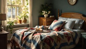
- Improved sleep quality in bedrooms painted with warm undertones
- Increased social interaction in communal spaces
- Reduced stress levels through softer visual environments
- Greater sense of home ownership and personal connection
These psychological advantages have made warm whites particularly appealing to families and individuals seeking to create genuinely restorative home environments. Understanding these emotional dimensions helps explain why the trend has gained such widespread acceptance across different demographics and design preferences.
Warm whites: a response to decoration trends
Natural materials and organic aesthetics
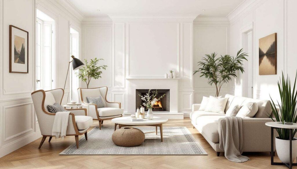
The rise of warm whites coincides perfectly with broader trends towards natural materials and sustainable design. Linen fabrics, oak furniture, rattan accessories, and terracotta ceramics all complement warm white backgrounds far more successfully than cool greys. This synergy has created cohesive design languages that feel both contemporary and timeless.
Designers have embraced this compatibility, using warm whites as neutral canvases that allow natural textures and materials to take centre stage without visual competition.
Maximalist and layered interiors
Current trends favouring maximalism and layered decoration have further boosted warm whites’ popularity. These shades provide the perfect backdrop for:
- Gallery walls featuring diverse artwork
- Collections of ceramics and decorative objects
- Patterned textiles and bold upholstery
- Vintage and antique furniture pieces
- Botanical displays and indoor plants
The warmth in these whites prevents spaces from feeling chaotic whilst still supporting rich, layered compositions. This balance has proved essential as homeowners move away from minimalism towards more expressive, personalised interiors. With these trends firmly established, practical implementation becomes the next consideration.
How to integrate warm whites into modern interiors
Selecting the right undertones
Successfully incorporating warm whites requires understanding their subtle undertone variations. Different rooms and lighting conditions demand different approaches. North-facing rooms benefit from whites with stronger yellow undertones to compensate for cooler natural light, whilst south-facing spaces can accommodate more neutral warm whites without appearing overly yellow.
Testing paint samples in situ remains essential, as undertones shift dramatically depending on:
- Natural light exposure throughout the day
- Artificial lighting types and temperatures
- Adjacent colours in furnishings and flooring
- Room size and ceiling height
- Existing architectural features
Layering warm whites effectively
Professional designers often employ multiple warm white shades within single spaces to create depth and visual interest. Walls might feature one tone whilst woodwork, ceilings, and alcoves use slightly different variations. This technique adds sophistication without introducing jarring contrasts.
The key lies in maintaining tonal harmony whilst creating sufficient distinction for architectural features to register visually. This nuanced approach separates professional results from amateur attempts. Understanding these practical applications naturally leads to direct comparisons with the previous favourite.
Comparison of warm whites and cool greys in decor
| Characteristic | Warm Whites | Cool Greys |
|---|---|---|
| Light reflection | Soft, diffused reflection | Sharp, crisp reflection |
| Perceived temperature | Cosy and inviting | Cool and distant |
| Compatibility with wood | Excellent, enhances warmth | Limited, creates contrast |
| Ageing appearance | Develops character | Shows dirt prominently |
| Versatility with colours | Complements most palettes | Works with limited schemes |
Long-term aesthetic appeal
Warm whites demonstrate greater longevity in design terms because they reference classical decorating traditions whilst still feeling contemporary. Cool greys, having dominated so completely, now risk appearing dated as tastes evolve. This cyclical nature of design trends suggests warm whites will maintain relevance longer due to their historical precedent and timeless associations.
These comparative advantages extend beyond aesthetics into practical considerations that affect daily living.
The aesthetic and practical benefits of warm whites in living spaces
Enhanced natural light distribution
Warm whites excel at distributing natural light throughout spaces without the harsh glare associated with brilliant whites or the light-absorbing qualities of greys. This creates ambient illumination that feels gentle and flattering throughout the day. Rooms appear larger and more open whilst maintaining intimacy and warmth.
Maintenance and longevity considerations
From a practical standpoint, warm whites offer several advantages:
- Minor scuffs and marks blend more naturally
- Less frequent repainting required compared to cool greys
- Easier colour matching for touch-ups
- Greater forgiveness with imperfect wall surfaces
- Better concealment of minor imperfections
These practical benefits make warm whites particularly suitable for high-traffic areas and family homes where durability matters as much as aesthetics. The combination of visual appeal and functional advantages explains why designers and homeowners have embraced this shift so enthusiastically.
The movement towards warm whites represents more than a passing trend; it reflects a fundamental reassessment of how colour shapes our domestic experiences. By abandoning the cool detachment of greys in favour of nurturing, versatile warm tones, UK designers have created interiors that prioritise emotional wellbeing alongside aesthetic sophistication. The psychological benefits, practical advantages, and remarkable versatility of warm whites ensure their continued prominence in contemporary design. As homes increasingly serve as sanctuaries from external pressures, the comforting embrace of warm white walls provides the perfect foundation for truly restorative living spaces that balance timeless elegance with modern sensibilities.