
Interior design trends constantly evolve, yet few techniques create such dramatic impact as colour drenching. This approach transforms spaces by enveloping walls, ceilings and trim in a single, unified shade, creating an immersive environment that challenges traditional decorating rules. Rather than relying on contrasting colours or white ceilings, this method embraces boldness and cohesion, delivering rooms with remarkable depth and character. The technique has gained momentum amongst designers and homeowners seeking to make powerful statements whilst achieving sophisticated, contemporary aesthetics.
What is colour drenching ?
The fundamental concept behind this decorating approach
Colour drenching represents a monochromatic painting technique where every surface within a room receives the same colour treatment. Unlike conventional decorating that pairs coloured walls with white ceilings and contrasting trim, this method applies one continuous shade throughout the entire space. The walls, ceiling, skirting boards, door frames, window frames and even radiators all share the identical hue, creating a seamless visual experience.
Historical context and modern interpretation
Whilst the concept draws inspiration from historical periods when entire rooms were painted uniformly, the contemporary interpretation focuses on intentional colour choices rather than practical limitations. Modern colour drenching celebrates bold pigments and sophisticated neutrals alike, transforming rooms into cocooning sanctuaries or vibrant showcases. The technique has evolved beyond simple paint application to become an architectural statement that redefines spatial perception.
Key characteristics that define proper drenching
Authentic colour drenching requires several essential elements:
- Complete coverage of all architectural elements including mouldings and fixtures
- Consistent sheen level across surfaces for visual harmony
- Deliberate colour selection that complements the room’s purpose and lighting
- Attention to undertones to maintain colour integrity under different lighting conditions
Understanding these foundational principles naturally leads to exploring why this technique has captured the imagination of design enthusiasts worldwide.
The benefits of drenching for your interior
Creating illusions of expanded space
Contrary to conventional wisdom suggesting white expands spaces, colour drenching actually blurs visual boundaries between surfaces. When walls and ceiling share the same shade, the eye cannot easily distinguish where one surface ends and another begins. This elimination of contrasting lines makes rooms feel more expansive, particularly effective in smaller spaces or rooms with awkward proportions.
Enhancing architectural features
The monochromatic approach draws attention to architectural details through subtle shadow play rather than colour contrast. Crown mouldings, panel work and ceiling roses gain prominence through dimensional depth, creating sophisticated visual interest without competing colours. This technique particularly suits period properties where original features deserve celebration.
Establishing powerful emotional atmospheres
Colour drenching delivers immersive environments that profoundly influence mood and perception. Deep blues create calming sanctuaries ideal for bedrooms, whilst rich terracottas generate warmth in living spaces. The technique amplifies colour psychology effects, as the complete saturation intensifies emotional responses beyond what accent walls achieve.
Practical advantages for maintenance and decoration
| Benefit | Description |
|---|---|
| Simplified paint selection | Eliminates need for coordinating multiple shades |
| Cost efficiency | Bulk paint purchase often reduces overall expense |
| Easier touch-ups | Single colour simplifies future maintenance |
| Flexible styling | Provides neutral backdrop for changing accessories |
These compelling advantages make colour drenching attractive, yet success depends heavily on selecting appropriate shades for your specific space.
Choosing the right shade for optimal effect
Assessing natural light conditions
Light quality fundamentally influences colour perception, making illumination assessment the crucial first step. North-facing rooms receive cooler, indirect light that intensifies blue undertones, whilst south-facing spaces enjoy warm, consistent illumination that handles bold colours confidently. East-facing rooms experience morning brightness but afternoon dimness, requiring versatile mid-tone shades. West-facing spaces reverse this pattern, favouring colours that perform well in golden evening light.
Considering room function and size
Purpose dictates appropriate colour intensity. Bedrooms benefit from restful, muted tones promoting relaxation, whilst home offices thrive with energising yet focused shades. Living areas accommodate broader colour ranges depending on desired atmosphere. Smaller rooms generally succeed with lighter tones that maintain airiness, though confident dark shades can create intimate, jewel-box effects when properly executed.
Understanding undertones and colour families
Every paint colour contains underlying pigments that emerge under different lighting. Seemingly neutral greys may reveal pink, green or blue undertones that clash with furnishings or appear unflattering. Testing large sample patches on multiple walls and observing them throughout the day prevents costly mistakes. Consider these factors:
- Warm undertones (red, yellow, orange) create cosy, inviting atmospheres
- Cool undertones (blue, green, violet) deliver fresh, calming environments
- Neutral undertones offer versatility but require careful selection to avoid appearing flat
Coordinating with existing elements
Flooring, fixed furniture and architectural features influence colour selection. Wood tones with warm undertones clash with cool wall colours, whilst cool-toned floors harmonise with similar paint choices. Consider permanent fixtures like kitchen units or bathroom suites when selecting shades, ensuring the drenched colour complements rather than conflicts with these investments.
Once you have identified the perfect shade, proper application techniques ensure professional results that maximise the technique’s impact.
How to apply the drenching technique
Essential preparation steps
Successful colour drenching begins with meticulous surface preparation. Fill cracks and holes, sand rough areas, and apply appropriate primers to ensure uniform colour absorption. Clean all surfaces thoroughly, as dirt and grease prevent proper paint adhesion. Remove or mask fixtures, hardware and switch plates, though some designers advocate painting around these elements for complete immersion.
Selecting appropriate paint finishes
Sheen levels dramatically affect the final appearance. Matt finishes absorb light, creating sophisticated, velvety surfaces ideal for hiding imperfections but challenging to clean. Eggshell offers subtle lustre with improved durability, whilst satin provides gentle shine suitable for higher-traffic areas. Consider using consistent sheen throughout or varying finishes strategically:
- Matt on ceilings to minimise imperfections
- Eggshell on walls for balanced aesthetics and practicality
- Satin on trim and doors for durability and subtle definition
Strategic painting sequence
Professional results require systematic application. Begin with the ceiling, working in sections to maintain wet edges and prevent visible joins. Progress to walls, using quality brushes for cutting in around edges before rolling main areas. Complete trim work last, ensuring crisp lines where different sheens meet. Apply multiple thin coats rather than single heavy layers, allowing proper drying time between applications for even colour saturation.
Addressing technical challenges
Certain scenarios demand special attention. Previously dark walls require additional coats or tinted primers when transitioning to lighter drenched colours. Textured surfaces like woodchip wallpaper may need removal for smooth, contemporary finishes. Glossy existing paint requires thorough sanding for proper adhesion. Calculate paint quantities generously, as running short mid-project risks colour matching issues between batches.
Even with careful planning and execution, certain pitfalls can undermine colour drenching projects.
Mistakes to avoid when drenching
Neglecting proper colour testing
The most common error involves insufficient colour evaluation before committing to full application. Small paint chips fail to represent how colours behave across large surfaces under varying light. Purchase sample pots and paint substantial areas on multiple walls, observing them for several days through different lighting conditions and times of day. This investment prevents expensive disappointment.
Ignoring existing room elements
Colour drenching creates powerful backdrops, yet must harmonise with permanent fixtures. Failing to consider flooring, countertops, bathroom suites or built-in furniture leads to clashing combinations that diminish rather than enhance spaces. Bring samples of fixed elements when selecting paint to ensure cohesive results.
Choosing colours based solely on trends
Whilst design trends provide inspiration, selecting colours purely for fashionability often results in regrettable decisions. Consider your personal preferences, lifestyle and how long you intend to maintain the scheme. Bold colours require confidence and commitment, whilst safer choices offer longevity. Ensure your selection reflects your aesthetic rather than fleeting popularity.
Skimping on paint quality or quantity
Budget paints deliver inferior coverage, requiring additional coats that ultimately cost more in materials and time. Premium paints provide better pigmentation, easier application and superior durability. Similarly, underestimating paint quantities leads to mid-project shortages and potential colour matching problems between batches. Calculate requirements generously, accounting for multiple coats and touch-ups.
Overlooking practical considerations
Different rooms demand different performance characteristics. High-humidity bathrooms require mould-resistant formulations, whilst kitchens need wipeable, grease-resistant finishes. Children’s rooms benefit from scrubbable paints, and high-traffic hallways demand durable surfaces. Selecting inappropriate paint types undermines longevity regardless of colour choice.
Learning from these potential missteps helps ensure success, whilst exploring real-world applications provides concrete inspiration for your own projects.
Drenching inspirations for every room
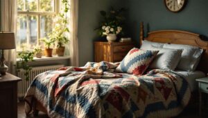
Bedroom sanctuaries
Bedrooms embrace colour drenching beautifully, with deep, restful shades creating cocooning retreats. Navy blues deliver sophisticated serenity, whilst forest greens provide grounding, natural calm. Soft terracottas and warm taupes generate comforting, womb-like atmospheres perfect for relaxation. Consider these approaches:
- Rich burgundy for dramatic, luxurious master suites
- Pale lavender for gentle, feminine sanctuaries
- Charcoal grey for modern, masculine retreats
- Dusty pink for contemporary, sophisticated spaces
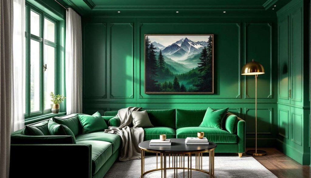
Living room statements
Living areas accommodate bolder expressions, with vibrant or deeply saturated colours creating memorable entertaining spaces. Emerald green delivers opulent drama, whilst burnt orange generates warmth and energy. For subtler approaches, consider mushroom taupes or soft sage greens that provide interest without overwhelming. The key involves balancing colour intensity with room size and natural light availability.
Kitchen and dining innovations
Kitchens traditionally favour lighter colours for practical reasons, yet colour drenching challenges these conventions successfully. Warm terracotta creates inviting cooking environments, whilst deep teal provides contemporary sophistication. Dining rooms excel with rich, appetite-enhancing shades like aubergine, rust or forest green that encourage lingering conversations over meals.
Bathroom transformations
Bathrooms offer ideal opportunities for adventurous colour choices due to their smaller scale. Deep blues create spa-like serenity, whilst blush pinks deliver soft glamour. Black or charcoal grey generates striking modernity, particularly effective in bathrooms with good natural light or generous artificial illumination.
Hallway and stairwell impact
Often overlooked, circulation spaces benefit enormously from colour drenching. These transitional areas lack furniture and artwork that might clash with bold colours, making them perfect candidates for dramatic statements. Consider mustard yellow for cheerful welcomes, or deep plum for sophisticated entrances that set the tone for the entire home.
Colour drenching represents a transformative approach to interior decoration that challenges conventional wisdom whilst delivering stunning results. This technique creates cohesive, immersive environments that enhance spatial perception, celebrate architectural features and establish powerful atmospheres. Success requires careful consideration of natural light, room function and undertones, combined with proper preparation and application techniques. By avoiding common pitfalls and drawing inspiration from successful implementations across various room types, you can confidently embrace this bold decorating method. Whether selecting restful bedroom hues or dramatic living room statements, colour drenching offers endless possibilities for personalising your home with contemporary sophistication and undeniable impact.